
This blog post is the start of a series of posts, which describe what you are able to do using the ohsome framework developed at the Heidelberg Institute of Geoinformation Technology (HeiGIT). OpenStreetMap (OSM), the biggest open map of our world, offers not only the current state of the data, but the whole historical evolution of it in a temporal resolution of down to one second. This rich source of data can be retrieved in the GeoJSON data format using the newest version of the ohsome API and then directly integrated into QGIS. Via the usage of the QGIS plugin TimeManager, it is possible to visualize the development of the displayed features over time. The following gif shows the evolution of buildings in Heidelberg (ways with the key “building”) from 2008-01-01 till 2018-01-01 in a monthly interval. Do you recognize the first mapped building of Heidelberg from this gif?
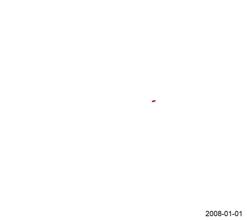
klick the picture to see the animated gif
The green ones are the buildings with the OSM tag “addr:city” and the red ones those without. Every time a building is displayed thicker, it has been edited in the respective month.
What do you have to do to get such a visualization of your city? There are only 3 steps necessary:
1) Data extraction using the ohsome API
For getting the needed data, we send a request to the ohsome api instance using this URL (https://api.ohsome.org/v1/elementsFullHistory/geometry?bboxes=8.6463%2C49.3714%2C8.7193%2C49.4361&keys=building&properties=tags%2Cmetadata&showMetadata=false&time=2008-01-01%2C2018-01-01&types=way). The important part is the spatial parameter “bboxes”, which you would have to adapt to your specific region.
2) Importing and preparing the GeoJSON data in QGIS
QGIS directly supports the GeoJSON data format. The only thing you would have to do is take the response file of the ohsome API and load it into QGIS, e.g. via drag-and-drop. Then you should choose the Polygons to import. Next, you need to specify an adequate reference system. We chose “Europe_Albers_Equal_Area_Conic” but feel free to choose one that fits best to your use case. Before starting to use the data with the TimeManager plugin, we recommend you to save the GeoJSON data as a GeoPackage file. To apply the different colors based on the “addr:city” tag, we defined an SQL function “addr:city” IS NOT NULL and colored the two values appropriately.
3) Creating the time series visualization using the TimeManager plugin
After you’re finished with setting an adequate color scheme, you can load the layer into the TimeManager. The start time is stored in the field “@validFrom” and the end time in the field “@validTo”. You can define additional animation and time format options as you like and then your animation should be ready to test within QGIS. TimeManager also offers the possibility to export the video as individual .png files for Windows, or directly as an animated gif or video for Linux or OSX.
The data used to create the gif was downloaded from our Germany Ignite instance. Besides that, we also have an instance using data from Nepal. If you have a request for a specific region, or any other suggestion or feedback, please do not hesitate to contact us via email under info@heigit.org. Stay tuned for further posts of this series to get to know more about our ohsome framework.