
The Ohsome Quality analysT (short OQT) is the name of a new software implemented by HeiGIT that is based on the #ohsome framework. Its main purpose is to compute quality estimations on OpenStreetMap (OSM) data. Any end user such as humanitarian organisations, public administrations, as well as researchers or any other institution or party interested in OSM quality can use the OQT to get hints on the quality of OSM data for their specific region and use case. The code will soon be made available as open source, but already now you can access the first proof of concept version via oqt.ohsome.org.
The Idea behind the OQT
The original idea for the OQT developed out of a simple use case: Having a one-click tool that can give information on the quality of the OSM data for a specific purpose. With OQT we want to address questions like:
Can I rely on the completeness of building data from OSM in a region where I want to organize a vaccination campaign in the near future? How complete is the road network in a specific region when I want to use it for car routing? How detailed are health care facilities mapped in OSM and which attributes are likely to be missing?
There are other tools available that work with OSM data in regards to the data quality. Software like Osmose, or the OSM Inspector or similar are used in the field of quality assurance with the main purpose to improve the mapping quality of OSM. The general topic of data quality though is on a different complexity level when it comes to the fitness for purpose of the data. Here, the main question is:
Is the OSM data good enough for my specific use case and within my area of interest?
To give support in answering that question, HeiGIT is developing an hopefully easy to understand quality analysis software that applies a simplification on the complexity on quality measurements by using a traffic light system with green-yellow-red as indicators. This can be achieved with as few as three clicks on the available OQT web page (not yet the aforementioned one-click solution, but we are just getting started…).
How to use the OQT
The website serves as a simple entry point to the OQT. The user can select a predefined area (this will be more flexible in future versions of course) and choose a respective quality report. The report can then be viewed in a following browser window (by clicking “Get Quality Report“). An example of how this view currently looks like can be seen in the following graphic.

In the background, a request is sent to an API when the quality report has been requested. This starts the processing and computations for the required indicators depending on the selected quality report. As the current examples on the web page are using precomputed indicators only, the response should be received relatively fast and is then displayed in a window that looks like the following graphic.
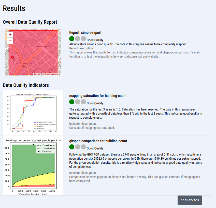
The results give an overall quality value for the selected area and topic, as well as for the individual indicators. They are displayed using a simple traffic light system (green-yellow-red) together with a textual explanation and individual graphs. There, you have a visual expression of the respective indicator and can also see the threshold curves for e.g. a yellow or red quality, as shown for the ghspop-comparison for building-count indicator in the graphic above.
In the upcoming download-as-pdf feature, those graphs will also be included in a high resolution with additional explanations. In the following two sections explanations on the two key features – indicator and report are given.
Indicator
An indicator is the basis of giving an estimation on the quality within the OQT. The current first POC release 0.1 features in total five working indicators. There are intrinsic indicators (using OSM data only) like the POI density, or the mapping saturation of buildings (looking at the development over time and if some saturation can be dedected), as well as extrinsic indicators, which are using OSM data together with other data sources like the mentioned global-human-settlement layer population data comparison with the OSM building count.
The output of every indicator is a normalized value between the scale of 0 to 1. This value is then categorized into a labelling schema of green-yellow-red to give an easier understanding on what a specific value can mean. Currently, this categorization is predefined for the different indicators, but the users will be able to customize this in future versions.
Report
The combination of a set of indicators is called a report in the OQT. It has again it’s own quality value & label, which is computed through weighting the respective indicator values. The weighting schema is another feature, that is currently predefined, but will be customizable soon. This means that users shall be able to weight the individual indicators for the overall quality value in future versions, which will allow to fine tune the setting for different use cases.
The current proof of concept version includes initially the following three draft reports: simple report (see example), remote mapping level one, and the sketchmap-fitness report, which was developed in the waterproofing project.
As mentioned in the introduction, one main goal of the OQT is to bring different quality developments based on OpenStreetMap data “under one hood”. This ensures that valuable results coming out of a research project are not forgotten once it is finished and can be used instead on a long-term basis and potentially on a bigger scale.
Conclusion & Next Steps
Currently the Ohsome Quality analysT can be described as a functioning OSM data quality analysis software, accessible via a web interface, giving an estimate on the quality of OpenStreetMap data for specific regions using a set of quality indicators that can be combined to quality reports. What different components are working behind the web interface and how they can be accessed (e.g. via an API or command line interface) will soon be described in another blog post about the OQT.
Please remember that this is a very first proof of concept implementation of the OQT. Future plans include adding a richer set of indicators, being able to customize the weighting of the different indicators, processing bigger areas of interest (e.g. using a national/hex-grid on global scale) and of course going open source to GitHub. Please get in touch if you have further ideas, or want to give feedback or contributions to the development, ideally via a mail to ohsome(at)heigit(dot)org.