
Welcome back to our blog post series How to become ohsome, where you get short and simple explanations on how you can become ohsome yourself!
This time, it’s all about our new endpoints, which enable you to track which contributions have been made with respect to a pre-defined region and time period. To explain the usage of the endpoints there will be two parts dedicated to them. This first blog post will deal with the data extraction endpoints /contributions/geometry and /contributions/latest/geometry whereas part two will deal with the contributions endpoints for data aggregation. Using the first mentioned endpoints, this week we will take a closer look at tagging behavior in relation to the xmas:feature option in OpenStreetMap. More specifically, we will look at Christmas markets and when they are tagged.
Boundaries
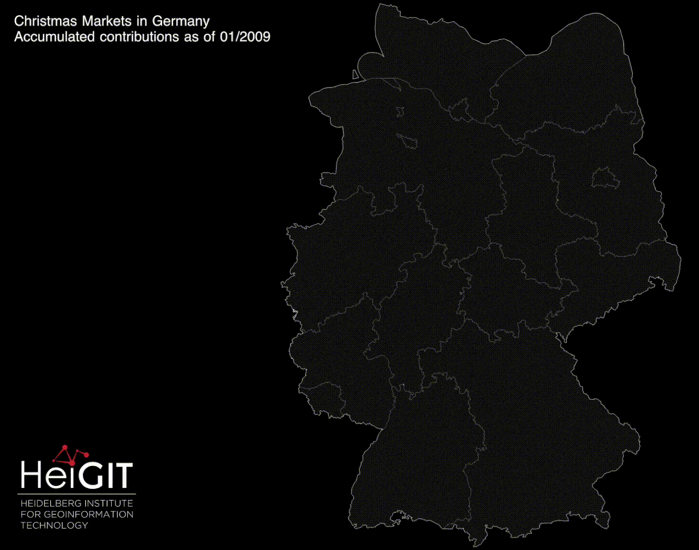
As usual, you first need an input boundary, which we got from here. We have chosen Germany for our analysis.
For this case study, we used the QGIS plugin ohsomeTools which we used to create our request to the ohsome API. How exactly this works you can read in our latest blog post.
Here is some key data:
filter: type:node and xmas:feature=* (a selection was made afterwards)
time: 2009-01-01,2021-12-01
Endpoint info:
The contribution extraction grants you direct access to all contributions provided to the OSM data. As with all our data extraction endpoints, for the output geometry you have the choice between /bbox, /centroid or the raw /geometry of each OSM object. For this analysis /geometry was used.
There are different contribution types, namely creation, deletion, tagChange and geometryChange. It is possible to retrieve these in a GIS via the attribute table and to view the desired type individually by making a selection. As aforementioned, we will have a closer look at the endpoints /contributions/geometry and /contributions/latest/geometry. With the first one, you can simply display all contributions made during a predefined time period. The latter endpoint allows you to display only the most recent changes made to OSM objects.
Data Exploration
/contributions/geometry:
Here’s the visualization in a better quality: ohsomeholidays
If you take a look at the animation, you can see that especially between the months October and December contributions are made, i.e. new data is added to OpenStreetMap, existing data is edited or deleted. This indicates that we are dealing with a feature which receives special seasonal attention. Namely, around the time of year for which the xmas:feature was introduced as well as slightly before that.
Furthermore, one can see that over the years especially many contributions were made in North Rhine-Westphalia and Thuringia. It should be noted that this is an accumulative visualization. As deletion is a contribution type not all points in the map might still be present in the OSM dataset of that date.
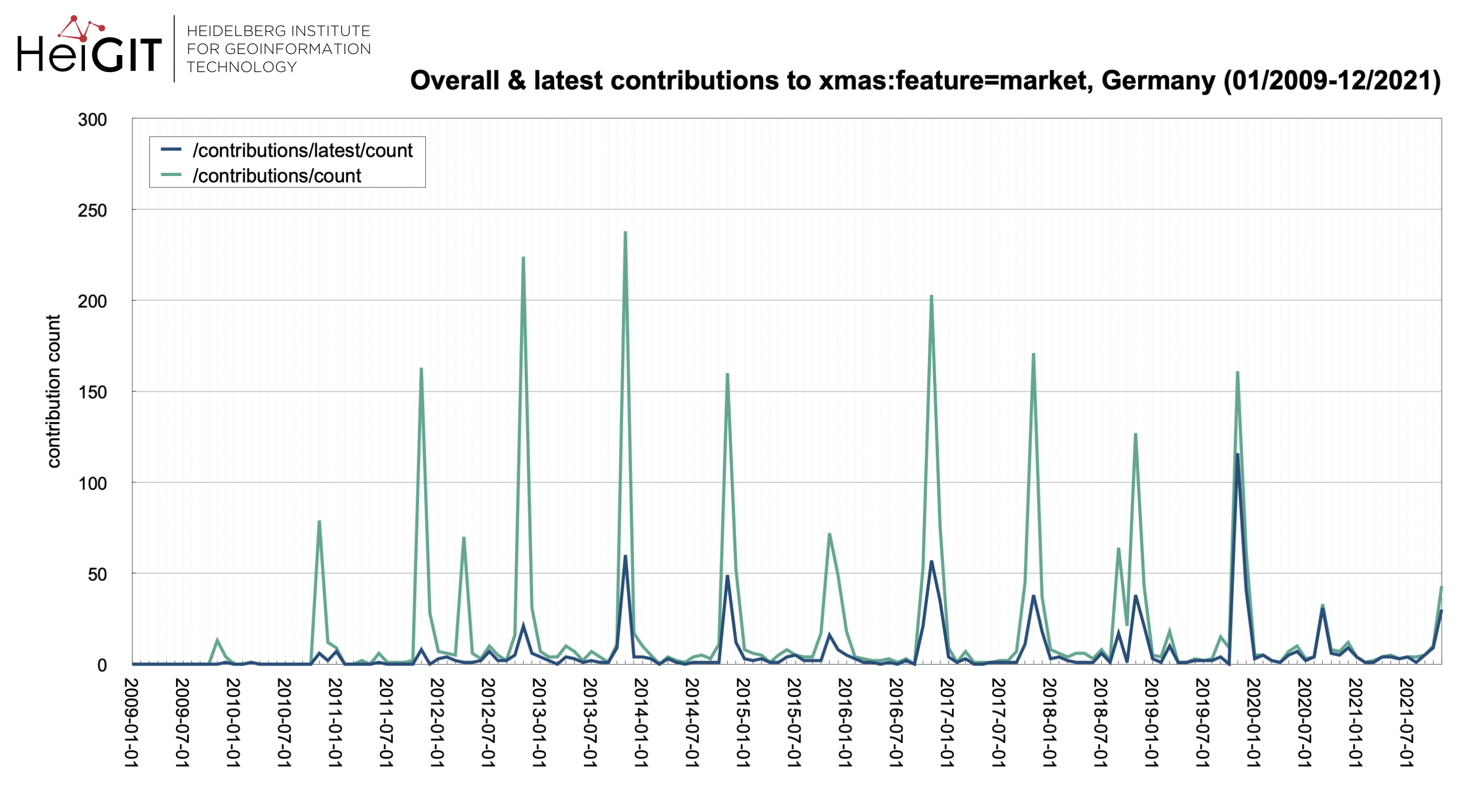
Above you can see an additional plot made with the filter “type:node and xmas:feature=market”, so you can see the development of contributions along a temporal axis. Here too, the seasonality mentioned before becomes visible very well. More on how you can request data such as this will be explained in the second part of the contributions-blog posts.
/contributions/latest/geometry:

These two maps are visualizations of ALL contributions (left) and the latest contributions (right), which were made in the period from January 2009 to December 2021. Since the endpoint /contributions/latest/geometry only takes into account the most recent contributions, the numerical values of the right map are, as to be expected, somewhat lower. However, as mentioned earlier in this blog post, the data extraction endpoint contributions can be used to distinguish not only latest from overall, but also the different contribution types from each other. This was done for the following three maps.
contribution types:

In this additional collage of maps you can see the individual contribution types which you can access via the attribute table of the output geoJSON. They’re not temporal but cumulative visualizations either, so all contributions are displayed collectively. In order not to overload the maps, the visualization option point cluster was chosen, which summarizes all points in a previously defined radius in one that displays the number of points summarized. While the geometries seem to be quite consistent, modifications of tags were quite frequent over time.
Thank you for reading our latest blog post! We wish you ohsome holidays and all the best for the new year! Part two of the contribution blog posts will be available at the beginning of 2022.
Until next time!
Background info: the aim of the ohsome OpenStreetMap History Data Analytics Platform is to make OpenStreetMap’s full-history data more easily accessible for various kinds of OSM data analytics tasks, such as data quality analysis, on a regional, country-wide, or global scale. The ohsome API is one of its components, providing free and easy access to some of the functionalities of the ohsome platform via HTTP requests. Some intro can be found here:
- ohsome general idea
- ohsome general architecture
- how to become ohsome blog series
- how spatial joins queries work in the OpenStreetMap History Database OSHDB